Report View
Reports and Frameworks
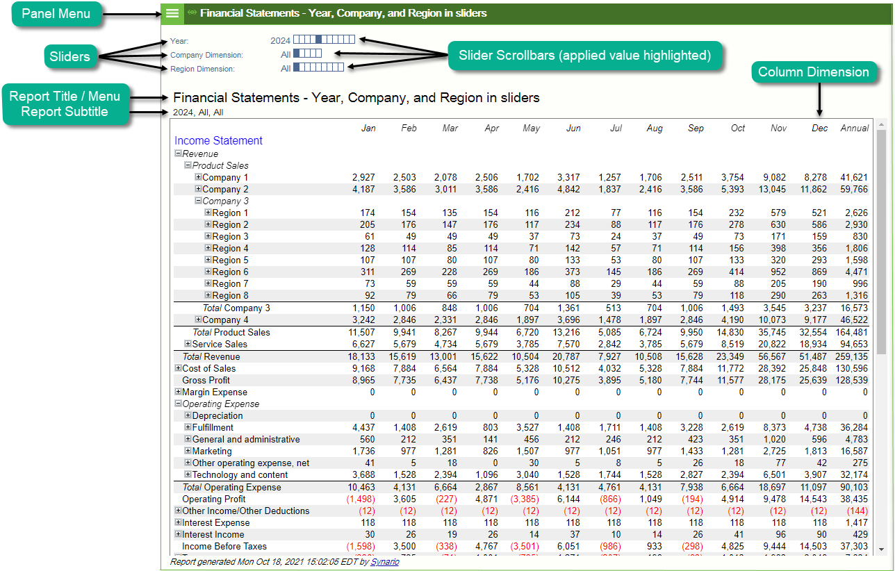
Reports combine a report spec and a framework. The content of the report will always be shown as rows, while the framework specifies how the data is organized into subrows, columns and sliders. Each column, sub-row and slider is organized according to time (years or periods), scenario, case dimension or case parameter. TItles in columns and the first row will remain visible even when scrolling to make viewing easier. To maintain screen real estate, Freeze Panes will be disabled when there are 11 or more sliders being used on a report.
Panel Menu
Edit See details in Report Title section below.
Export
- HTML Converts the report to HTML HyperText Markup Language format and opens it in a new window.
- HTML (all groups opened) The HTML report with every group expanded to reveal all line items.
- CSV FileConverts the report to CSV Comma Separated Values format and saves it to your computer in the default download directory.
- CSV File (all groups opened) The CSV report with every group expanded to reveal all line items.
- Email to Converts the report to HTML HyperText Markup Language and adds it as attachment to an email.
- Zipped file of Reports Converts multiple slides into a zipped file of reports
Panel Management Various options to Maximize, Move, or Navigate between panels.
Report Sliders
Report sliders provide an easy to use, scalable way of viewing many possible reports (or slides). A new report can be generated by simply clicking on one of the boxes in any slider, or using the mouse wheel to scroll through a slider dimension. Clicking on the current report value (for example, "Scenario 1," in the diagram above) will show a drop down menu of all possible values. Clicking on the slider dimension title (for example, "Scenario:" above) will show a menu for configuring the slider such as changing the range of values. The subtitle shows the set of current slide values.
Shared Sliders in Reports
Shared Sliders in Reports, offer the ability to keep the selected Slider data in sync between multiple reports or between reports and charts. To share Sliders from reports:
-
Navigate to the desired Report or Framework.
-
Click on the Slider Title that you wish to share and select "Manage Elements from the pop-up menu.
-
Click the "Shared" checkbox.
-
Click Save.
Some Sliders Dimensions cannot be shared with a Chart of Chart. In those cases, "(Report Only)" will appear next to the shared box in Manage Elements. The dimensions that cannot be shared are "Year" and "Case Parameters".
Sharing a slider will update the initial slider value for all frameworks where the same slider is already shared. The initial slider value from the report from which it is last shared will become the initial slider value for all the shared sliders of that given element.
Certain aspects of Reports and Frameworks can be configured within the displayed report itself by clicking on an element of the model. These include:
Report Title
View Report Spec <Specification Name> or Framework <Framework Name>
Copy Framework to sandbox, Report Spec to sandbox, Report Spec and Framework to sandbox.
Retitle Report Specification, Framework, Subtitle.
Modify Slider Dimension Click to modify the display of Slider Dimensions. Move to Rows, Move to columns, Delete, Manage Elements.
The above Modify Slider Dimension options are also available by clicking on sliders that have already been added above the report.
Styling Option Group available for Models transitioned to use Report Stylers and includes:
Change Styles: Select from a selection out-of-the-box report template styles.
Report Title: Quick access to formatting options for Report Title
Report SubTitle: Quick access to formatting options for Report subtitle.
For more information, see Report Stylers.
Elements or Sliders available to be added to report for (Time, Scenarios, Table, Model Dimensions, (Case Dimensions, Parts Dimensions), Case Parameters, and FO Parameters).
Saves the current slider selections. Values will be retained in the report until changed.
Save the current state of group expanded or collapsed in the report.
Restore Initial Opened Groups Restores the report the last saved state of opened and collapsed groups.
Open All Groups Opens all groups. Note: The more groups to open in a given report, the longer this operation may take.
Close All Groups Closes all groups. Note: The more groups to close in a given report, the longer this operation may take.
Zoom Popup Displays report in a zoom-enabled pop-up window. Use the + and - controls to increase or decrease the zoom level. The zoom level will be retrained by the model until changed. Click Close to return to the normal view.
Export Report HTML, HTML (all groups opened), CSV, CSV (all groups opened).
Table Title
Copies the table and adds it below the original.
Deletes the table.
Opens Table object in a new panel.
Report Elements (such as Revenue, Cost of Sales, Assets)
Copy Report Element Copies the element and adds it below the original.
Delete Report Element Deletes the element from the report.
Move
- Moves the element to the first position.
- Moves the element up one position.
- Moves the element down one position.
- Moves the element to the last position.
Styling: colors, fonts,...
Creating custom formatting for your reports is easier than ever with Stylers! Transition your reports from legacy styles and start using Report Stylers today!
- Select from a palette of colors to apply as background color to the report cells or enter your own HTML color code.
- Select from a palette of colors to apply as background color to the report text or enter your own HTML color code.
- Enable or disable bold for text.
- Enable or disable italics for text.
- A range of size selections from x-small to x-large.
- Arial, Courier, Georgia, Impact, Tahoma, Times New Roman, Trebuchet, Verdana.
Opens the element in a new panel.
Dimensions (Case, Part, Time in sub-rows or columns)
Styling: colors, fonts,...
Creating custom formatting for your reports is easier than ever with Stylers! Transition your reports from legacy styles and start using Report Stylers today!
- Select from a palette of colors to apply as background color to the report cells or enter your own HTML color code.
- Select from a palette of colors to apply as background color to the report text or enter your own HTML color code.
- Enable or disable bold for text.
- Enable or disable italics for text.
- A range of size selections from x-small to x-large.
- Arial, Courier, Georgia, Impact, Tahoma, Times New Roman, Trebuchet, Verdana.
Copies (Column, Row) and adds it below the original.
Opens (Column, Row) in a new panel.
Delete (Column, Row) Deletes the column or row from the report.
Manage Elements Pops up a window to enable or disable display of report elements or to add new elements. A "Check" option
Retitle Give the dimension a different title.
Insert before A selection list of categories elements of the report that this row or column can be inserted before.
Insert after A selection list of categories of elements of the report that this row or column can be inserted after.
Move (Column, Row) Position determines the available move options: Left, Right, Up, Down, etc.
<Title of dimension> Framework Dimension options
Values
Included in a report is the ability to see an explanation of how that number was calculated. The explanation will appear in its own panel. allowing you to explore it. Click on groups or buttons to reveal additional layers of detail.
A new cell-specific element will be added to the framework-report combination. If one or more already exist for this cell, you will be able to select from a list which one you wish to edit.
Parameters
Title: The default for this framework component is descriptive of its location in the report.
Kinds: Includes Style, Threshold, and Footnote.
- Style: This is the default.
- Threshold: This Kind provides the ability to specify the upper and lower numeric thresholds for the style to be in effect
Example: If you want the cell(s) specified to be colored yellow only if the value is greater than 500 and less than 5000.
- Footnote: Inserts a footnote into the report for the specified cell(s).
Example: You might want to add a footnote to explain why a specific cell has this value.
Constraints: Allows you to limit where the styling is to be applied. By default, the style is constrained to a specific cell (e.g. Year, Month, Line Item, Part, Case, etc.). Each of these can be modified as desired. If you select , it instructs the software to apply the style to all elements of the dimension.
Style: Allows you to specify how the constrained elements are to be styled. Please see Report Styling for details on styling a report.
(Add a footnote directly to the report rather than through the Edit/New Styling option above).
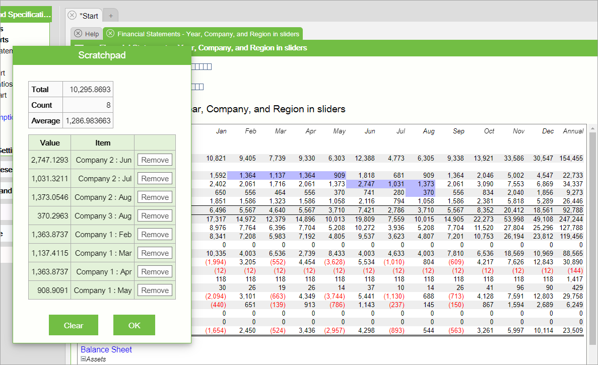
Report Scratchpad
Click report cells to select from the following options for "on demand" summation and averages of the cells you include:
Add to Scratchpad Adds the selected number to a report Scratchpad, a convenient ad-hoc calculator which displays a summary at the top of the Total (value of cells added), Count (the number of cells added, and Average. A table shows the value of the each cell included, the name of the cell and a button to remove individual cells. A Clear button removes all cells from the Scratchpad.
When there is at least one cell in the Scratchpad, the cell(s) included are also highlighted on the report and more options will appear when clicking on cells as follows:
Extend Scratchpad Selection from last added cell Creates a range of cells to add to the Scratchpad from the last cell that was added.
Show Scratchpad Pops up the Scratchpad to display the current cells added.