Chart Theme
A Chart Theme object specifies the look and feel of a chart, but not its content, which is the purpose of a Chart object.
Creating a Chart Theme
- In
- Click . A new chart theme object will be created.
- Title the chart theme.
- Copy the colors and borders or all properties from some existing theme, including the standard themes that come with all models.
- Modify the colors or other properties.
- To view the results, select a chart and change the theme to use your newly created chart theme.
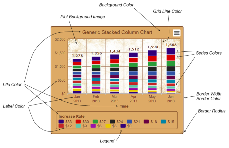
Chart Theme Properties
Chart Themes are subdivided into six separate parts.
Colors
The color properties specify overall colors of series, backgrounds, borders and grid lines, as well as the plot background image. Colors associated with text or legend are displayed in other parts.
- Background Color - specify the background color of the entire chart
- Border Width - specify the width of the chart's border. A width of zero means there is no border
- Border Color - specify the color of the chart's border
- Border Radius - specify the curvature of the border's corners (in pixels)
- Series Colors - specify the colors used in a series. (Tip: the number of colors should not be a multiple of 5 to maximize the ability to distinguish between different lines, as there are 5 marker shapes) (Tip: the first few colors will be the ones most often used, so make these the most popular colors.) (Tip: make sure adjacent colors are distinct from each other as they will be adjacent in pie charts and stacked charts)
- Plot Background Image - specify a URL of the background image of the plot area
- Grid Line Color - specify the color of the X and Y grid lines in the plot area
- Slider Highlight Color - specify background color on mouseover slider scrollbars
- Data Label Color - specify the color of the data labels
- Stack Label Color - specify the color of the stack labels
Font Options
The fonts section specifies various font properties of text displayed in the chart. Instead of a long linear list of font properties for each kind of text, a matrix of font properties and text types are displayed.
The font properties include:
- Font color
- Font size
- Font family (e.g. Times Roman, Helvetica, Comic Sans MS, etc)
- Font weight (normal or bold)
- Font style (normal or italic)
The text types include:
- Default values - the default color and font family used for other text types that don’t specify these values
- Main Title - the main title of the chart
- Other Titles - the X axis title, the Y axis title and the legend title
- Y Axis Labels
- X Axis Labels
- Legend Labels
- Tooltips
X Axis Options
- X Axis grid line width - specify width in pixels of the X Axis grid lines or zero if there should be none
- X Axis label rotation - normally 0 for horizontal labels (rotation is also used in X Axis scaling option)
- X Axis top of chart - specify yes to place X Axis labels at the top of the chart rather than the bottom
- Reverse X Axis labels - specify yes to reverse the order of the X Axis labels
- Include X Axis Title - specify yes to include the X Axis title in the chart
- X Axis Label offset - specify number of pixels between the plot and X Axis labels
Legend Options
- Include Legend in the chart - specify yes if the legend box is to be included in the chart
- Include Legend Title - specify yes to include the title of the legend in the chart
- Reverse Legend Labels? - specify yes to reverse the order of the labels
- Legend background color - specify the color of the background of the legend box
- Legend Item Hover color - specify color of item title on mouse over
- Legend Hidden Item Color - specify color to use for items that are hidden
- Legend border width - specify width in pixels of the legend border, or 0 if there is no border
- Legend border color - specify the color of the legend box border (if any)
- Legend border radius - specify the curvature of the border's corners (in pixels)
Tooltip Options
The tooltips section specifies what and how chart tooltips are displayed for individual points in the chart. In addition to border and background properties, is a text box for “Tooltip Format” that specifies what will be displayed in the tooltip. In addition to putting in text in the text box, you can enter special codes to display specific information about the selected point. Each code begins the with characters “@[“ and ends with “]” (just like translated terms). Line breaks in the format also define how the tooltip can be spread across multiple lines. Some codes are not applicable to all points and so are not displayed along with the entire line in which it appears. This allows the tooltip to be applicable to a wide variety of charts and situations. The table below lists all codes, as well as a few HTML constructs that can be used to build a tooltip.
| Code | Meaning |
|---|---|
| @[value] | The value of the selected point. |
| @[name] | The series name of the selected point. |
| @[xlabel] | The X Axis label of the selected point. |
| @[change] | The percentage change from the previous column. Not displayed for the first column. |
| @[percentage] | The percentage of the stack total. Displayed only for stacked charts. |
| @[total] | The total of all stack items. Displayed only for stacked charts. |
| @[totalchange] |
The percentage change of the stack total from the previous column. Displayed only for stacked charts not in the first column. |
| @[all others] | The translated term using the current set of terms. |
| <b> xyz </b> | Display xyz as bold. |
| <i> xyz </i> |
Display xyz as italics. |
Other Options
- Marker Radius - specify the radius (in pixels) of the markers used to identify data points in the chart
- Polar Chart - specify yes to display the chart as a polar chart