Charts with Monte Carlo Simulations
Monte Carlo simulation is only available to users with appropriate access privileges
Creating a Monte Carlo Simulatio
Step 1: Create an Analytical Chart
Create or reuse an analytical chart that is not a bubble chart, pie chart or waterfall chart.
Step 2: Add random case parameters
Using the Add submenu, add any number of randomized case parameters. The randomized case parameters may not already be selected for either the X Axis or Series. For each randomized case parameter, select a probability distribution and enter the required probability distribution parameters.
Step 3: Select number of Monte Carlo trials
During development select a small number of trials (between 100 and a 1000). For analysis, select the number of trials you believe is sufficient to provide a representative set of possibilities (between 1,000 and 10,000 trials).
Step 4: Analyze Charts
A new variation option will appear in the variations submenu that allows viewing the Monte Carlo simulation results. The default view is to simply show the same chart using the mean value of the Monte Carlo trials. Views include:
- Mean - shows the mean value of all chart data points
- Median - shows the median value of all chart data points
- Standard Deviation - shows the standard deviation of all chart data points
- Quartiles per series - shows the quartile ranges for any chart series.
- Deciles per series - shows the decile ranges for any chart series.
- Mean, median, and standard deviation - shows these 3 quantities for any chart series
- Correlation Coefficients per Random input - shows the correlation coefficients of a random variable (a slide dimension of all random inputs is displayed)
- Correlation Coefficients per Series - shows the correlation coefficients for a chart series
- Scatter Plots - shows the scatter plot of a random input for any chart data point. Three slide dimensions are used to select the random input, and the series and X Axis value of any chart data point. Sliding along any of these dimensions will show how the scatter plot varies across different model dimensions.
Example: Monte Carlo Dinners
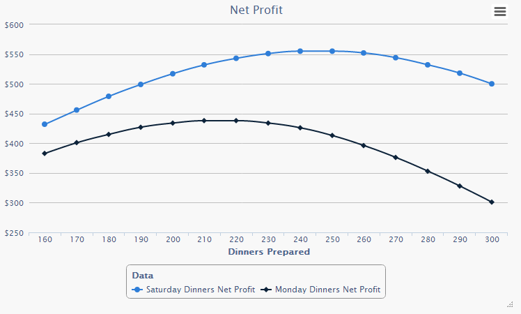
Each day, a restaurant prepares dinners ahead of time and serves them that evening to customers for $4 a dinner. It costs about $1.50 to prepare a dinner, and about $0.25 to dispose of an unsold dinner. These costs vary slightly day to day (due to price fluctuations and menu variants). The number of customers also varies day to day. Historical data provides all the necessary information for creating probability distributions for these 3 variables. How many dinners should be prepared to maximize profit? Three case parameters are created to represent the preparation cost, disposal cost and number of customers. A simple chart is created with the number of dinners to prepare on the X Axis, and net profit on the Y Axis. Two series are shown for Saturday dinners and Monday dinners. The curves clearly show the optimal number of dinners to prepare. On Monday the optimal number is about 210 and on Saturday about 245.
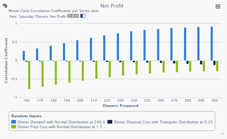
The next chart shows the correlation coefficients for the three random inputs, and it shows how the correlations vary over the number of dinners prepared.
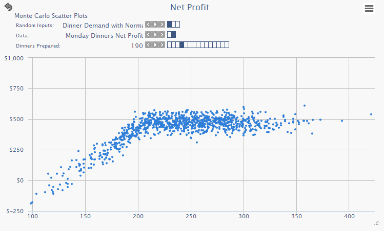
The next chart shows the scatter plot for Monday dinners when 190 are prepared with respect to the randomized input variable (number of customers). The downward slope on the left represents the loss incurred when there are few customers.